


28th May 2026
An Ice Cream Tub That Won Awards for Honesty — The Story Behind NIC's Half-and-Half Design
Most ice cream tubs make big promises on the lid, then quietly disappoint once you open them. NIC Ice Creams decided that wasn't good enough.
From the start, NIC was doing something different inside the tub: thoughtfully sourced milk, carefully chosen ingredients, and no artificial colours or flavours. The product itself had a personality. The next challenge was helping people see that before they took the first spoonful.
After years of thinking, tweaking, and plenty of "research," NIC partnered with Firebrand for a full brand overhaul. The question was simple: if better ingredients make better ice cream, how should the packaging prove it?
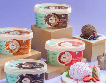
The Half-and-Half Idea
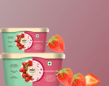
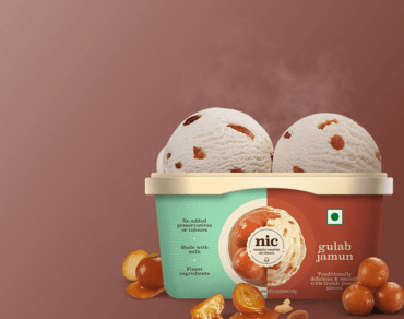
The solution was a tub split into two clear halves — each with its own job.
One half shows the finished scoop: creamy, textured, and honest about what you'll find when the lid comes off.
The other half shows the ingredients that made it: fruit, nuts, saffron, chocolate — recognisable, unhidden, and upfront.
Two halves. One scoop. Complete transparency.
Instead of relying on tiny ingredient lists or lofty claims, the packaging explains visually and instantly. There's no decoding required, no marketing leap of faith — just a straightforward visual conversation between the brand and the person holding the tub. A distinctive tub shape helps it stand out in a freezer full of near-identical containers, so your hand naturally finds what your eye has already picked.
Honesty as a Design Principle
What makes the half-and-half concept genuinely interesting is that it turns honesty from a comforting brand value into a design principle.
Here is the scoop you'll enjoy — and here is exactly what went into it.
The "honestly crafted" idea runs through everything: from the tub at home to the first time someone spots NIC online. The packaging becomes the brand's first conversation with a new customer, starting with ingredients instead of glossy illusions. It's a small but meaningful shift — choosing to earn trust through clarity rather than charm. In a world where customers are increasingly thoughtful about what they eat and increasingly sceptical of packaging that oversells, that kind of straightforwardness doesn't just feel refreshing. It feels necessary.
That level of visual integrity — where design reinforces the product's truth — helped NIC win at India's Best Design Awards.
Why It Still Works
Years later, the half-and-half tub remains one of the most recognisable ice cream designs in India. It has lasted because it's built on an idea, not a passing trend: if your product is genuinely thoughtful, your packaging should be too.
Every new flavour NIC launches follows the same rules:
- Same distinctive tub.
- Same half-and-half split.
- Same clear promise before the lid even moves.
That consistency matters more than it might seem. When every flavour tells the same honest story in the same honest way, the design stops being just packaging and starts becoming a signature — something customers recognise, trust, and return to.
In a category where packaging often overpromises and underdelivers, NIC's tub does something quietly radical: it just shows you the truth. And that everyday honesty turned out to be not only refreshing — but award-winning.
Other blogs
10th Jun 2026
Signs Monsoon Has Arrived and NIC Already Has the Perfect Scoop for It
One day it's blazing hot. The fans are running at full speed. Everyone is complaining about the heat. And then, one next morning, without any warning, the sky turns a shade of grey that means business. The air smells different, and somehow everyone in the house just knows. Monsoon has arrived.
Read More
25th Jul 2025
Why Strawberry Ice Cream is Perfect for All Ages
Ever notice how strawberry ice cream is the one flavor that never causes family arguments? Kids love the sweet, fruity taste and that pretty pink color. Adults get hit with childhood memories the moment they see it.
Read More
21st Jul 2025
Gulab Jamun Ice Cream: A Delicious Twist on the Indian Classic
What happens when India's most beloved sweet meets ice cream innovation? Gulab jamun ice cream - and it's actually genius when you think about it.
Read More